UX Redesign of AWS Product Detail Pages
Project overview
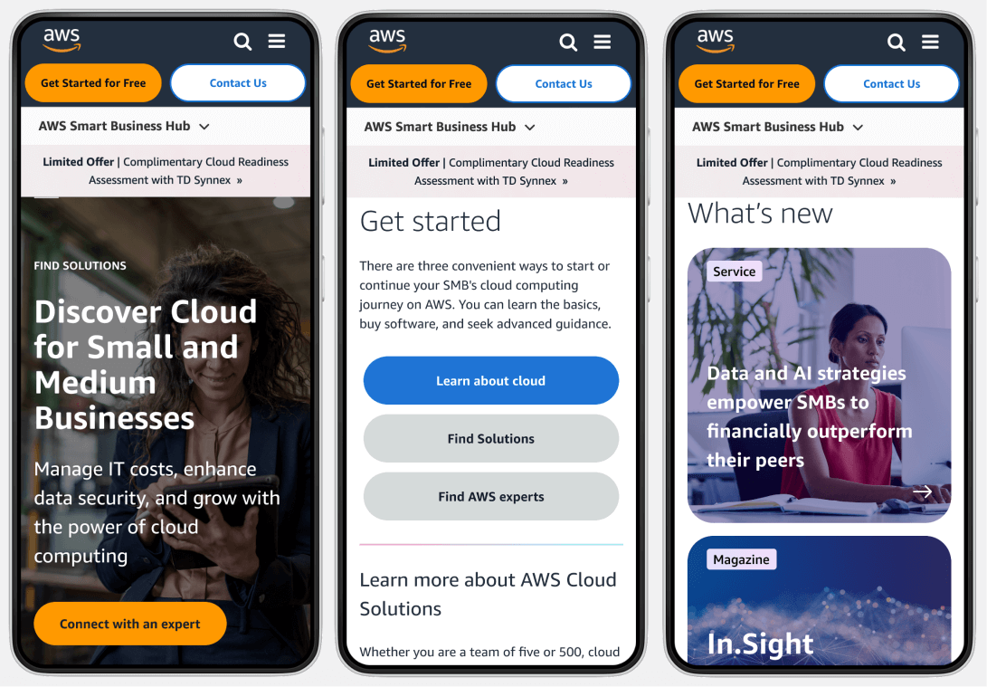
The Product Detail Pages (PDP) on the AWS Small and Medium size businesses (SMB) website are critical touchpoints for customers seeking detailed information about these offerings. This case study outlines the process of redesigning 17 of the PDPs to enhance user experience (UX), improve accessibility, and drive conversions.
Goals and Objectives
- Improve Usability: Ensure that users can easily find and understand information.
- Enhance Accessibility: Make pages accessible to all users, including those with disabilities. with our product offerings.
- Increase Engagement and Conversion Rates: Encourage users to interact with the page and take desired actions (e.g., sign up for services, contact sales, watch a product video).
- Simple access to products and services:
Improve navigation between related products.
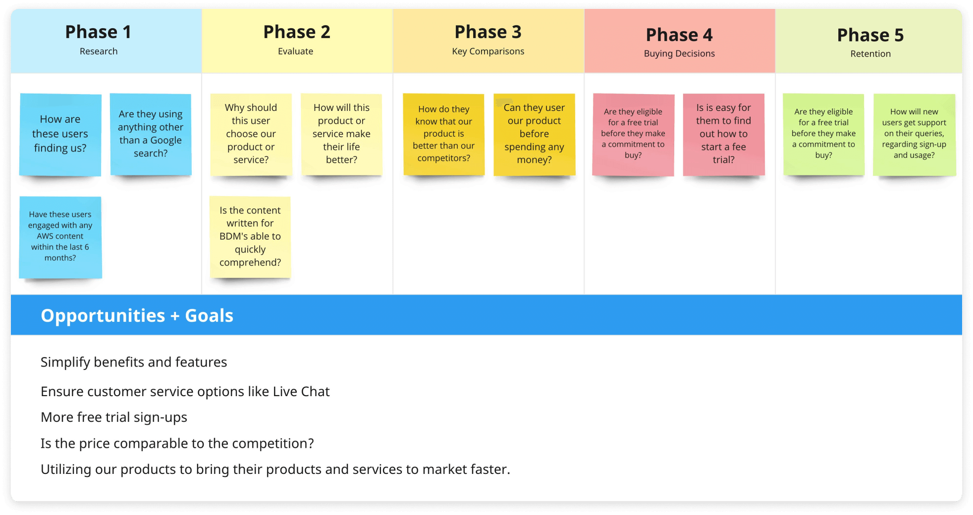
Journey map
The users and the choosers
Research and Analysis
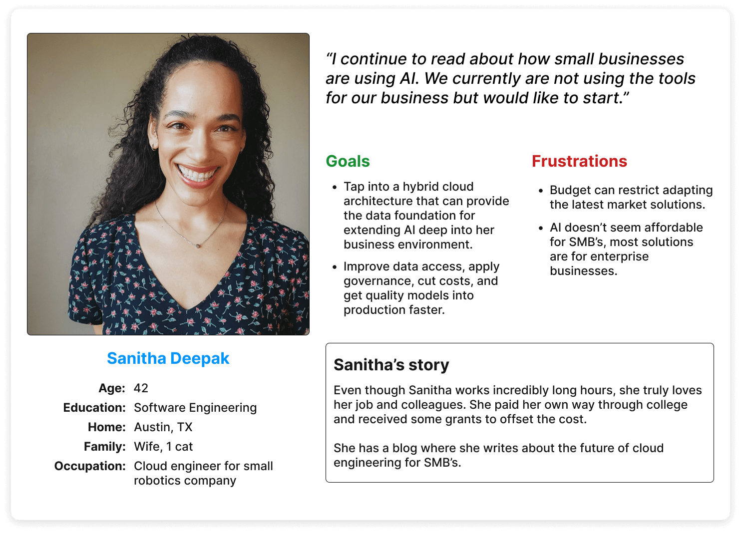
AWS conducted a study that assessed the impact of UX design optimization, which was informed by a 2022 usability study. Nine individuals participated in unmoderated interviews, with an average satisfaction rating of 4.18/5. Overall, participants found the page content extensive and easy to navigate, but mobile users experienced friction due to excessive scrolling. Participants did not distinguish between exploring content relevant to their use case and exploring by industry.
Some of the frustrations from the Business Decision Maker (BDM) and Technical Decision Maker (TDM) differed. We really had two masters to serve with this project: the chooser and the user. The BDM was going to make a decision, with some input, based on the needs of the small business. The TDM was going to actually use the product or solution.
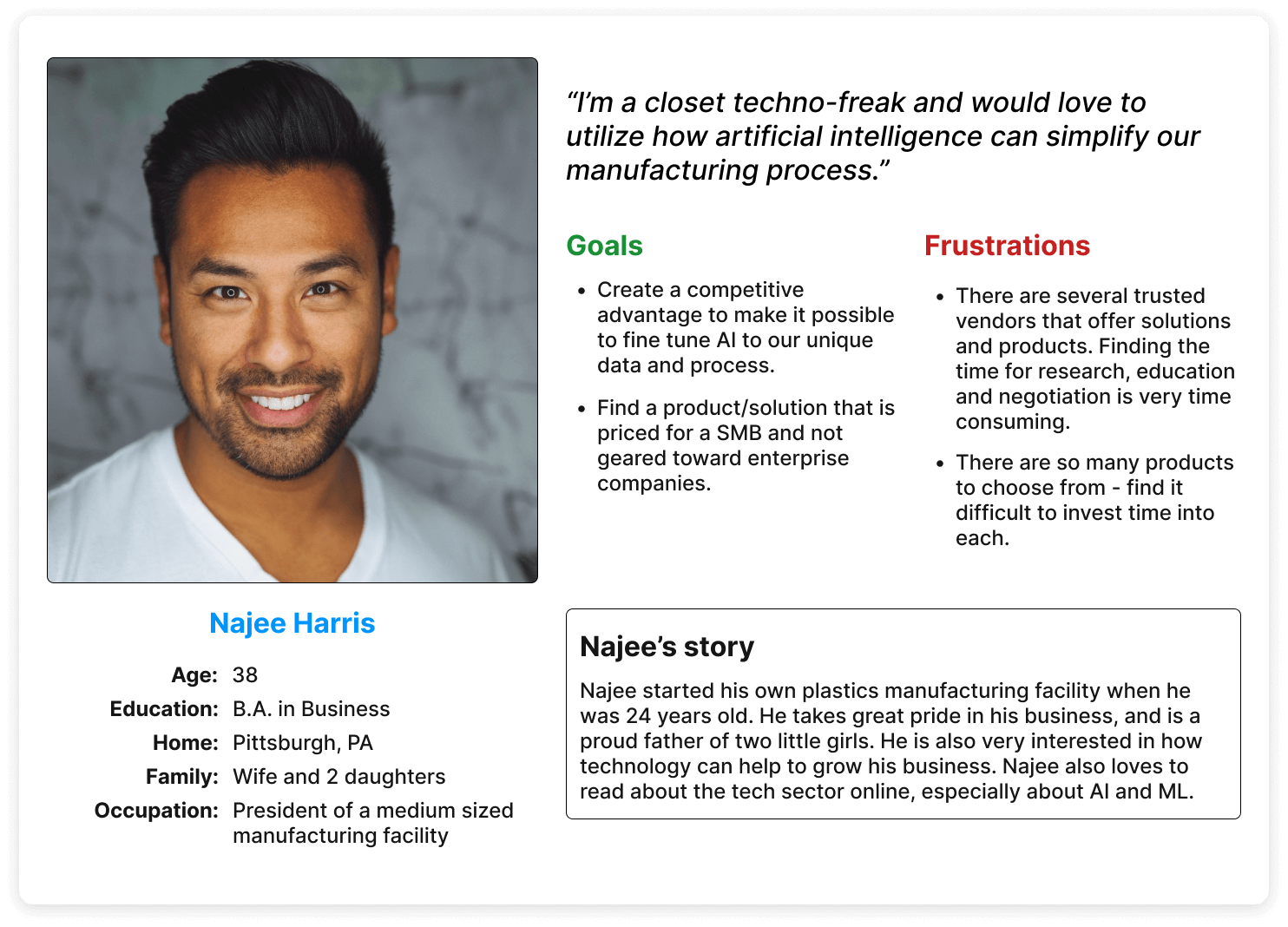
Personas developed from AWS user research
User Research
- Interviews and Surveys: Conducted with a diverse set of users including developers, IT managers, and business executives to understand their needs and pain points.
- Usability Testing: Performed on the existing PDPs to identify areas of confusion and frustration.
- Increase Engagement and Conversion Rates: Encourage users to interact with the page and take desired actions (e.g., sign up for services, contact sales, watch a product video).
- Simple access to products and services:
Improve navigation between related products.
Competitive Analysis
- Analyzed PDPs from competitors such as Microsoft Azure and Google Cloud to identify best practices and areas for differentiation.
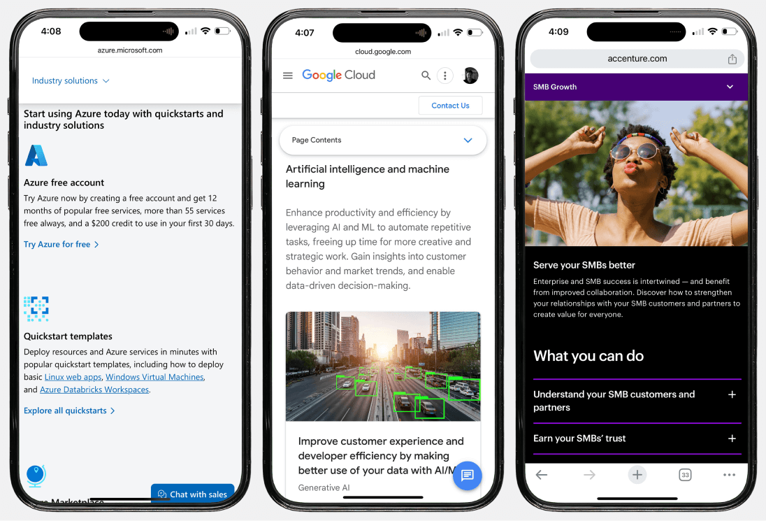
Competitive review: Azure; Google Cloud; Accenture
Data Anaylsis
- Reviewed analytics data to understand user behavior, including common navigation paths, time spent on pages, and drop-off points.
key findings
- Complex Information Architecture: Users found it difficult to locate specific information due to the dense and complex layout.
- Less buttons and more links: The pages did not correctly differentiate a button from a link (state change from journey), but it was also visually overwhelming.
- Inconsistent Design Elements: Inconsistencies in design and layout made it challenging for users to navigate between different product pages.
- Accessibility Issues: Identified several accessibility issues, such as poor color contrast and non-descriptive link texts.
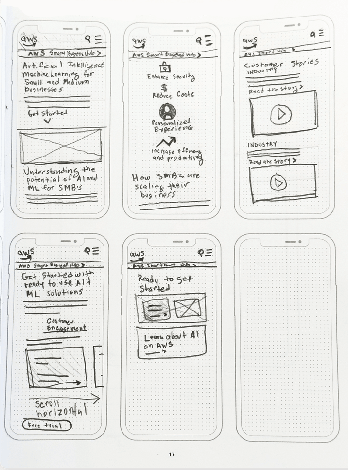
Initial sketch of the user flow
Design process
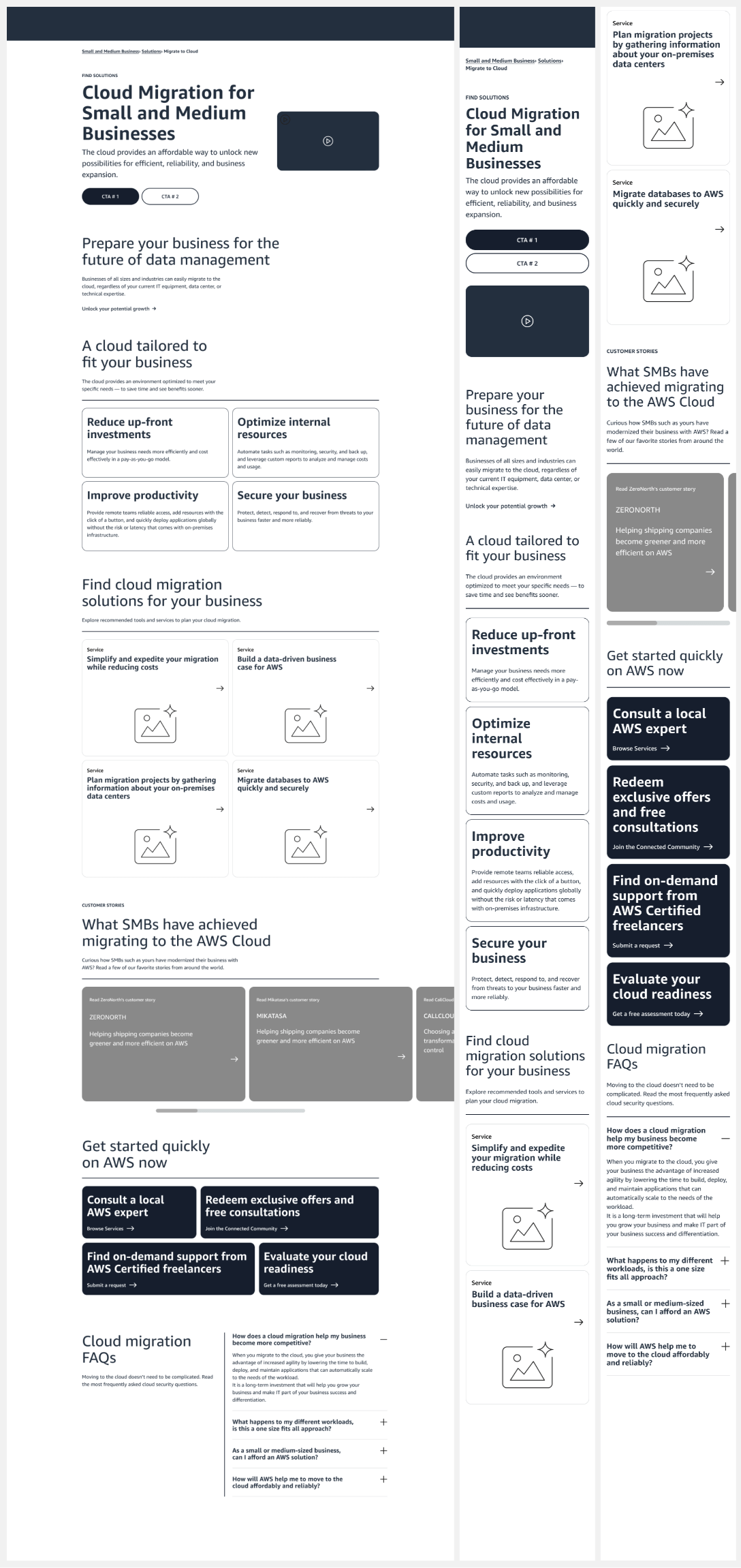
- Information Architecture: Simplified the IA by grouping related information together and creating a clear hierarchy. This Introduced a consistent layout across all PDPs for uniformity.
- Wireframing and prototyping: Simplified the IA by grouping related information and creating a clear hierarchy. This Introduced a consistent layout across all PDPs for uniformity
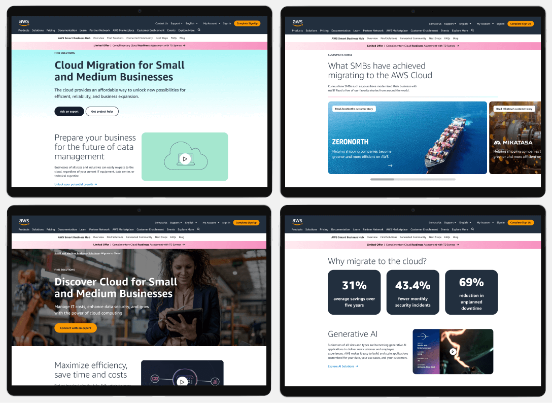
- High-Fidelity Design: Created high-fidelity prototypes incorporating AWS branding and visual design guidelines, focusing on readability, clean layout, and prominent CTAs.
- Accessibility Enhancements: Ensured compliance with WCAG 2.1 standards and added features like keyboard navigation, ARIA labels, and improved color contrast.
Key Features of the Redesigned PDP
- Clear and Structured Layout: Organized information into sections such as Find Solutions, Features, Customer Stories, and FAQs. Utilized accordions and tabs to manage large amounts of content without overwhelming the user.
- Prominent and Clear CTAs: Positioned primary CTAs (e.g., “Start Free Trial”, “Contact Sales”) prominently.Used contrasting colors to make CTAs stand out.
- Responsive Design: Optimized the layout for various screen sizes, ensuring a seamless experience on mobile devices.
- Micro Interactions: Created specific moments within a product that accomplishes a single task while enhancing the overall user experience like: Button animations; Form field validation; Toggle switches and Hover effects.
As the UX designer, I wanted to keep the balance between brand integrity and providing a refreshing look to the user.
The final result is a clean, easy-to-navigate, and relevant experience to the users who can benefit from this page.
- User-Centered Design
- Simplified Navigation
- Clear Information Hierarchy
- Responsive and Fast
At the time of this design, the videos had not been purchased
results
Average time spent on page
A good benchmark for Average Time on Page is 52 seconds, however we were getting 82 seconds.
Filling out a form
The average amount of time it took our users to complete a form was over 4 minutes. After the implementations, it took on average only 96 seconds.
Boosted conversion rates
Creating dynamic content increased personalization to boost conversion rates by 15%
More shareable content increased Micro Conversions by over 35%.
Users reported finding information more easily and appreciated the structured layout.