Designing a website for college graduates involves creating a user-friendly, visually appealing, and informative platform that caters to their needs as they transition from academia to the professional world. Here are some key elements to consider for a college grad site design:
Objective
To create a comprehensive, user-friendly website that provides resources, networking opportunities, and career guidance for recent college graduates.
Project Scope
In a recent poll, 68% of college grads stated that they feel very alone and vulnerable trying to get their career in gear. This was not an entirely new project; we had an existing Grad Page, but unfortunately, the traffic to the site was relatively low.
Research and Planning
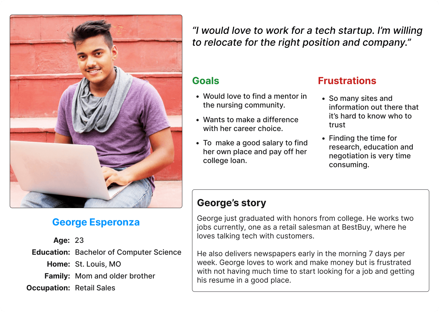
User Persona Creation

competitor analysis
Reviewed websites like LinkedIn, Indeed, and university career centers. Identified strengths (e.g., job boards, networking features) and weaknesses (e.g., lack of tailored content for recent grads).
One of the many benefits of being in the Boston area is having our pick of colleges to conduct user research. We conducted face-to-face interviews with over two dozen ready-to-graduate students and two town hall events and job fairs, giving us valuable insights into what these potential grads thought about our site and their next important step in life.

Key Features Defined:
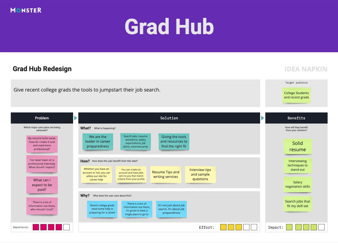
design and development
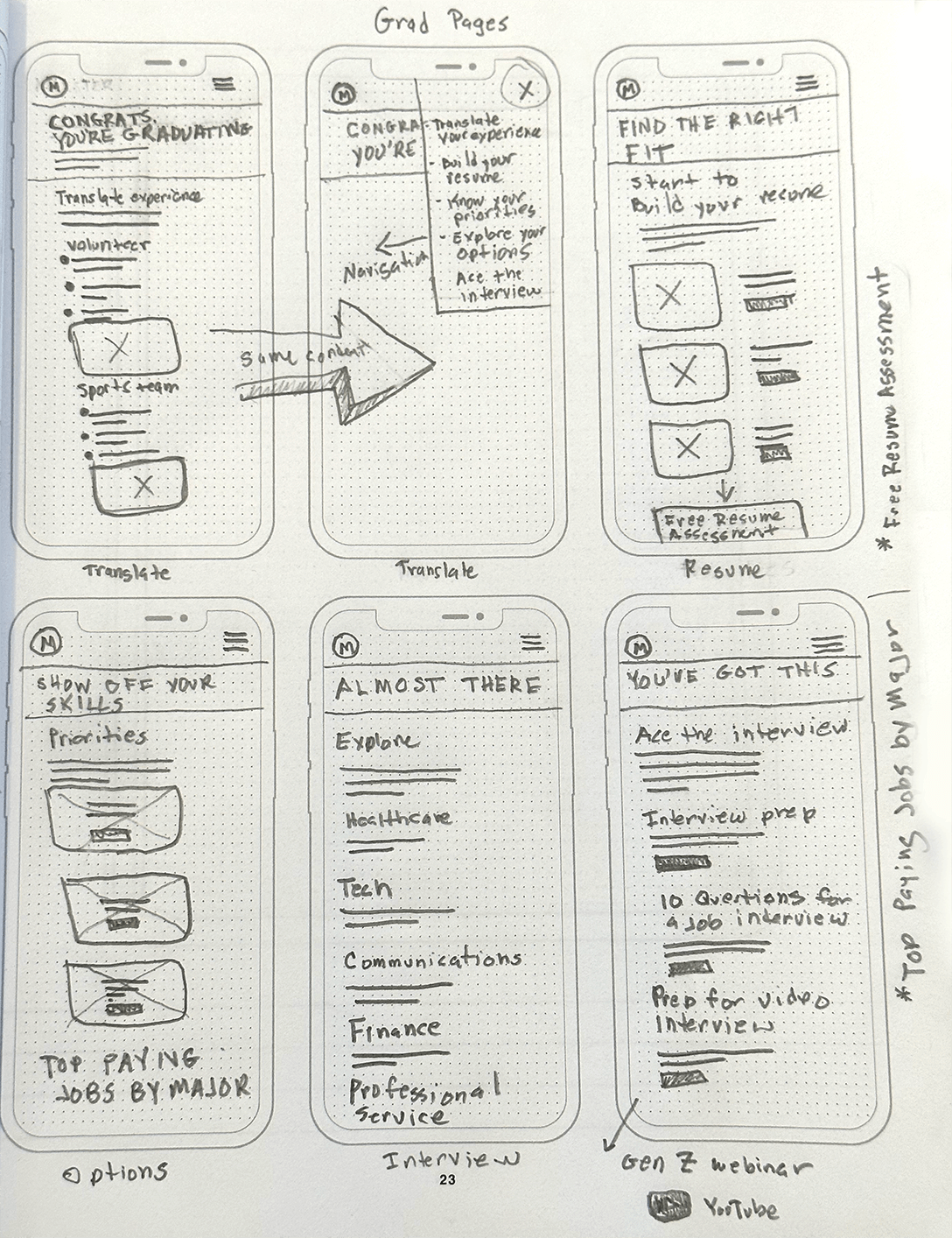
The wire-framing process was where things began to fall into place and become more tangible. Initial paper sketches were an excellent start. I quickly transitioned into Figma and got busy framing.
Research

User Experience

Prototyping

Usability Testing

Wireframing and Prototyping:
Moving through some more realistic flows by linking up the low-fidelity wireframes was a valuable exercise. This helped me identify gaps and issues like missing steps, useless steps, and unclear call-to-action buttons.
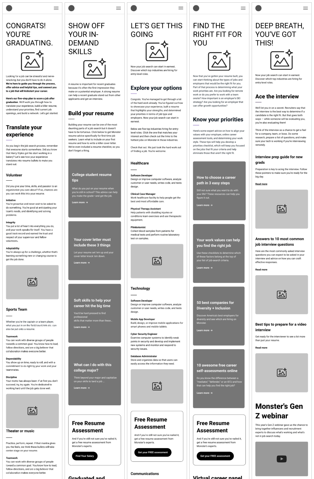
UI and ux design
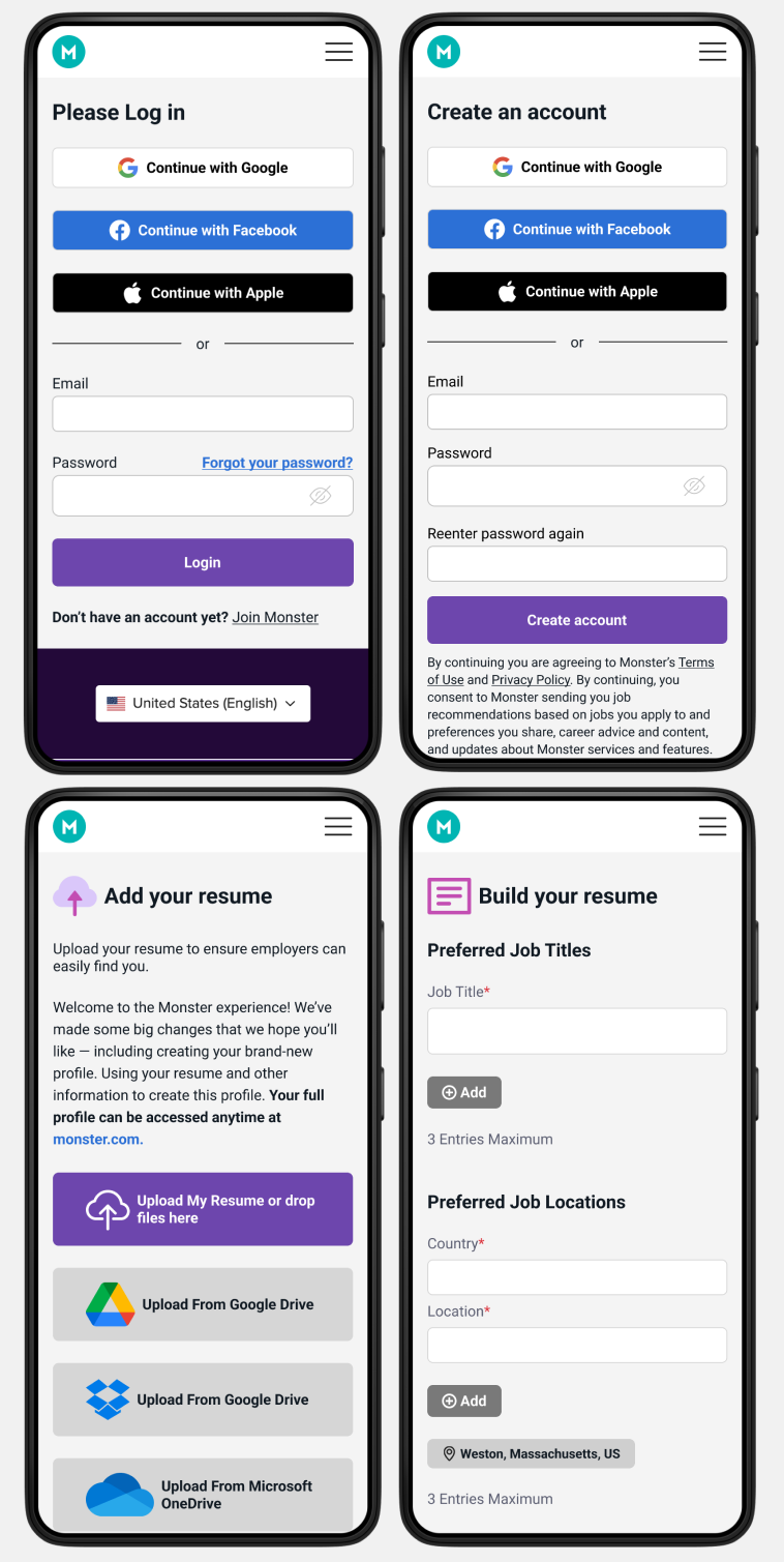
The original page did not have a login or account creation option. Having that option on these pages was critical for necessary conversions. The debate was whether there should be a link to the home page where our sign-up and account creation are located, or apply that experience to this page. The decision was made because there were several options for micro-conversions on the pages but no real macro-conversions.
Why this was important:
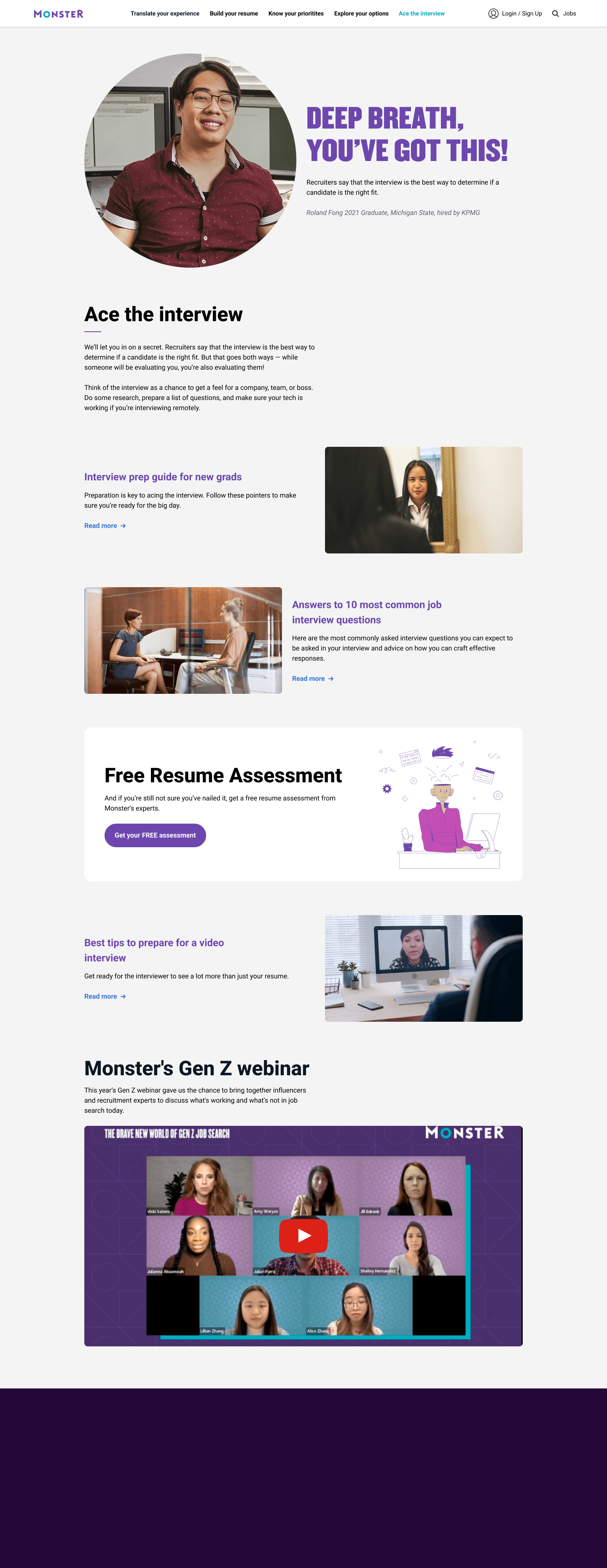
Emphasized a clean, modern design with a consistent color scheme. Made sure that the navigation is easy to understand and use, and that everything is accessible.
testing and launch
Usability Testing:
Instead, companies need overlap. We needed a group of people who had a range of skills. From research and strategy definition to interaction and UI design skills, I was happy to contribute in any way possible to make this successful.
Using different micro-interactions and state changes for a smooth, easy-to-understand navigation and immersive experience

Launch Strategy
This project was a great reminder that my job as a designer is to make the best experience with what is available. While some of the more ambitious and exciting design explorations were passed over due to constraints with the data, what shipped was a robust design that worked great with all the various ways the site could be used.
Minimal use of
results
This project was a great reminder that my job as a designer is to make the best experience with what is available. While some of the more ambitious and exciting design explorations were passed over due to constraints with the data, what shipped was a robust design that worked great with all the various ways the site could be used.
Increased Engagement
The site saw a 50% increase in user engagement within the first three months.
Average session duration increased by 42%, indicating valuable content and user-friendly navigation.
High User Satisfaction
Surveys indicated a 86% satisfaction rate among users.
*We used a 1-7 rating scale
Positive feedback highlighted the comprehensive resources and easy-to-use interface.
Improved Job Placement:
Significant improvement in job placement rates for recent graduates using the site.
Partnered with over 200 colleges to list job opportunities.
Numerous success stories of graduates finding jobs and mentors through the platform.
My biggest takeaway is to take care and time with user research and user flow mapping, as it’s vital to the integrity of a clean and clear site. Also, understanding users’ needs, tendencies, human behavior, universal UI graphics, layouts, and current technologies and practices, all play significant roles in the success of a great UX/UI design.