Project Overview
Company: Monster
Project Duration: 5 months
Team: CPO, UX Designer, Product Manager, Developer, Content Marketing, Product Marketing, Data
Improve user satisfaction, cart abandonment, and conversion rates by redesigning the plan selection, company dashboard, and job posting flow to enhance usability and accessibility.
Objective
WHAT'S THE PROBLEM
After conducting a focus group of 20 active users of our hiring site, there was consistent feedback on our B2B platform and hypotheses from several cross-functional teams.
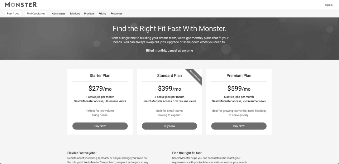
Hiring page paywall from early 2018
Shared Understanding of Goals
Planning a new job posting flow, paywall flow, and dashboard redesign is quite an undertaking due to the impact on every business area. We had to get everyone involved early—product managers, UX designers, engineering, content managers, writers, and data analysis team members.
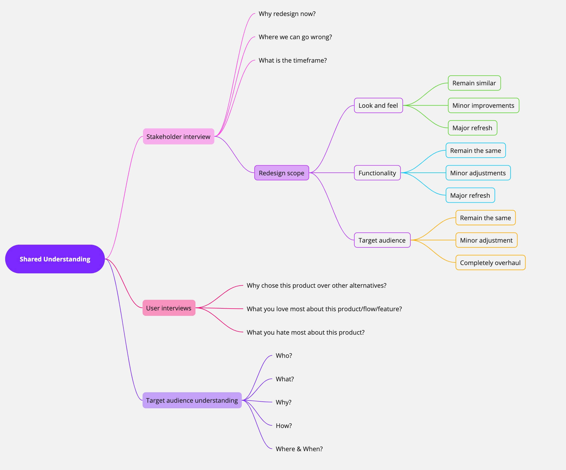
A Shared understanding diagram to Improve decision-making and problem-solving
research phase
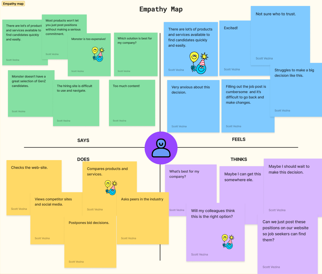
You always want to know how your users feel—what they think, their pain points and frustrations, and how they apply that to your product or service.
User Research Methods: Surveys, Remote Usability Testing, Moderated Focus
Group Participants: 10 existing users, 10 potential users
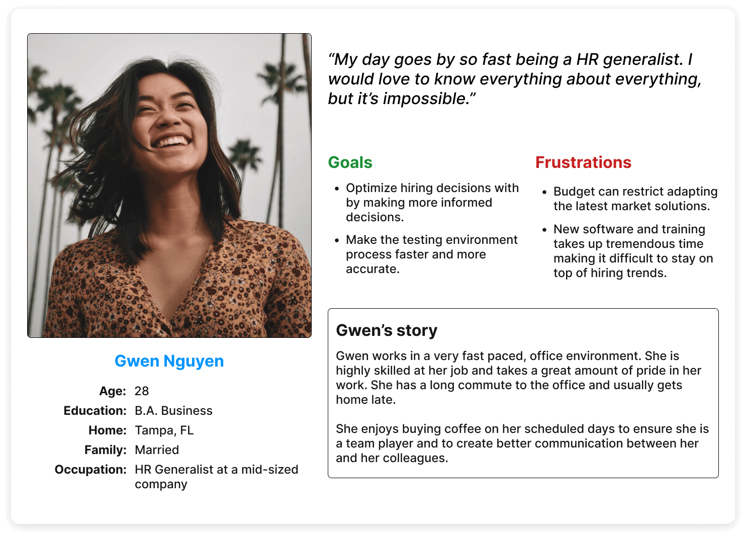
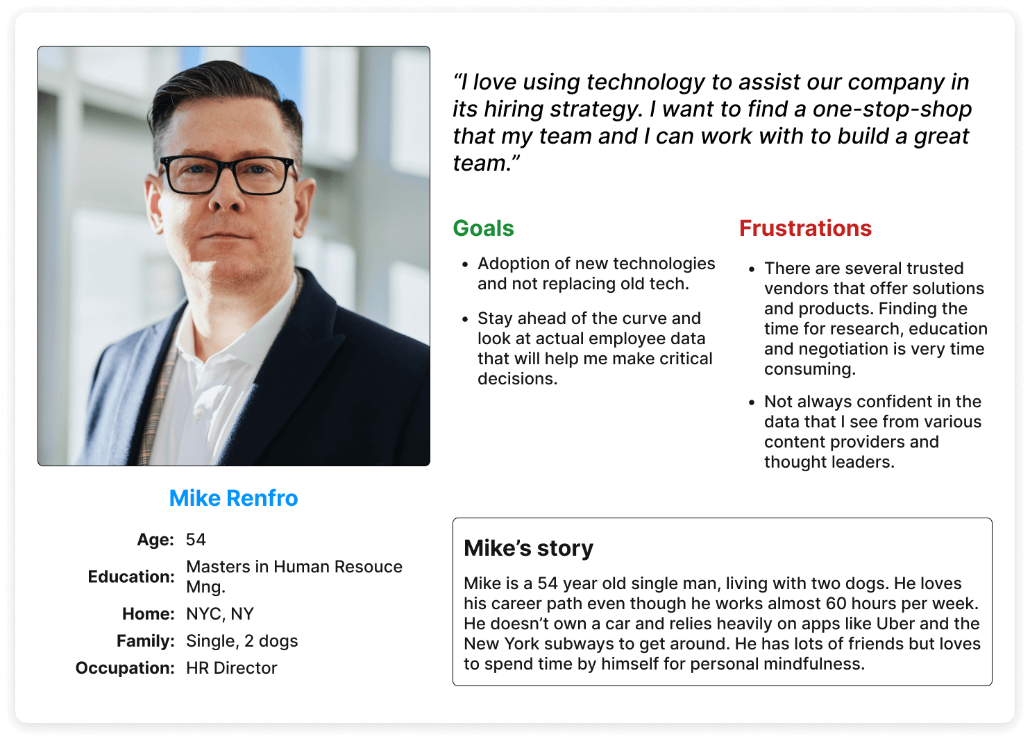
Two of four personas used in exploration
Key Findings
Pain Points
User Needs
Competitive Analysis
I analyzed top 5 competitor products to identify best practices and potential areas for differentiation. Our team did a heuristic overview of our site to gain additional insights into potential friction that the site needed to tackle.
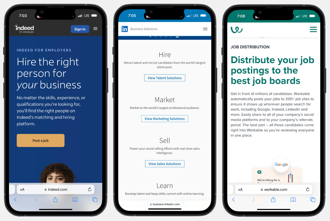
It’s one of the first questions that should come to mind. “Well, what are others doing?” As your users will have to choose between your product and its alternatives, you need to analyze the experience they provide to customers. When reviewing both direct and indirect competition, look for commonalities, and similar flows. Define what is considered a standard experience for your case.
My responsibilities
As the lead designer for this product, I needed to align different teams and their responsibilities to complete the project successfully. With all the knowledge, opinions, data, and mandates, every team member who touches a design project needs the potential for greatness. And it’s not the process that gets you there. It’s not a design trend, a favorite font, or yet another pseudo-name for problem-solving. It’s people.
Research & Testing

User Experience

Prototyping

Wireframing

Can a user's experience really be designed? No matter how good you are at planning an intended outcome, an experience is far too complex, nuanced, subjective, and personal to be planned. No one else owns that experience except the user.
As an organization, we value customer journey mapping because it effectively visualizes the interactions between a customer and our brand. Showing the countless ways our users can get from point A to point B and how the processes in place might aid or deter them.
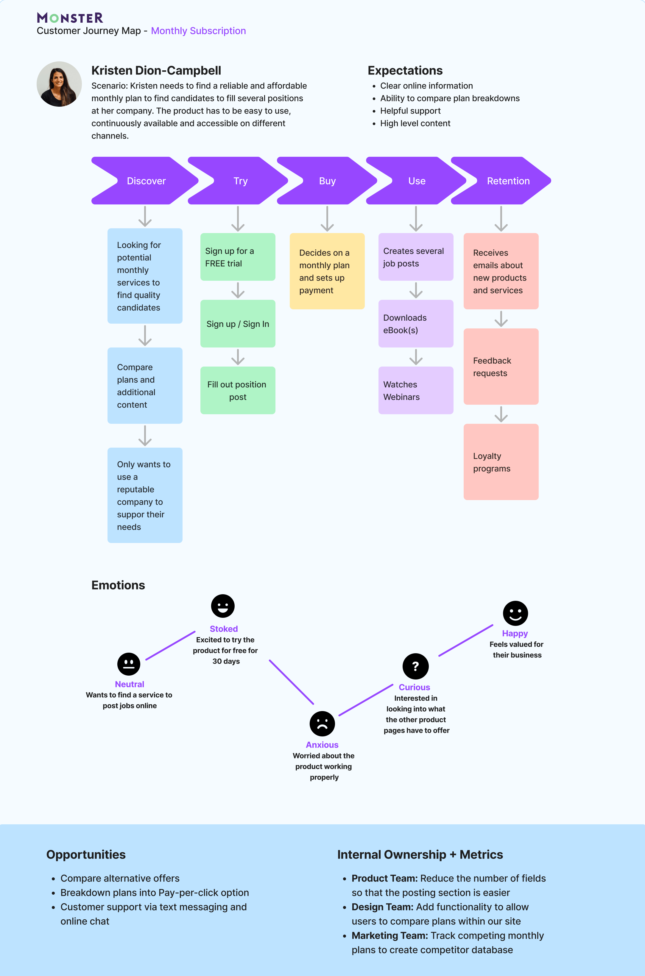
Customer Journey Map
design phase
Brainstormed solutions addressing user pain points and needs. Created low-fidelity sketches to visualize potential layouts and interactions.
Ideation and Sketching
Not according to our users! They found that having three options created decision fatigue. Many said that the first and second option, and the second and third were so close that it made it challenging to decide.
Initial Concepts
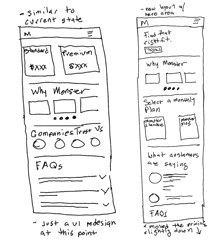
Initial sketch for a new hierarchy
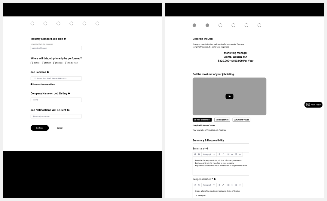
Wireframes of both the Job Post and plan options
Prototypes
Based on research and user feedback, personalized experiences designed with the user in mind ensure the site meets their needs and preferences, making them more likely to convert.
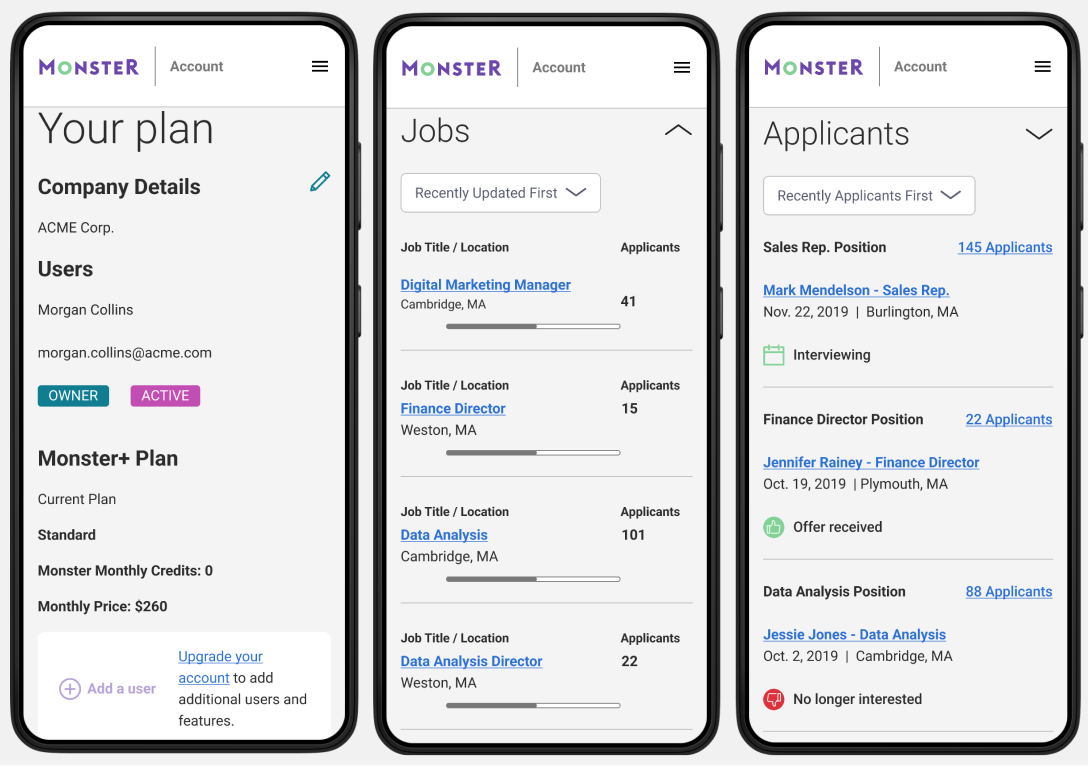
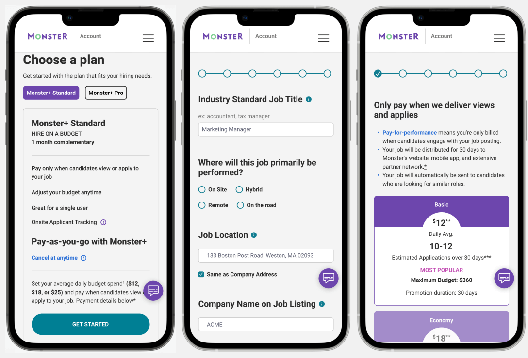
Mobile view of the new dashboard
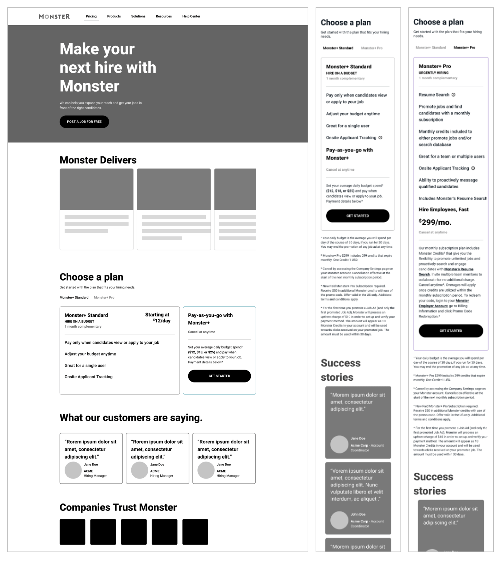
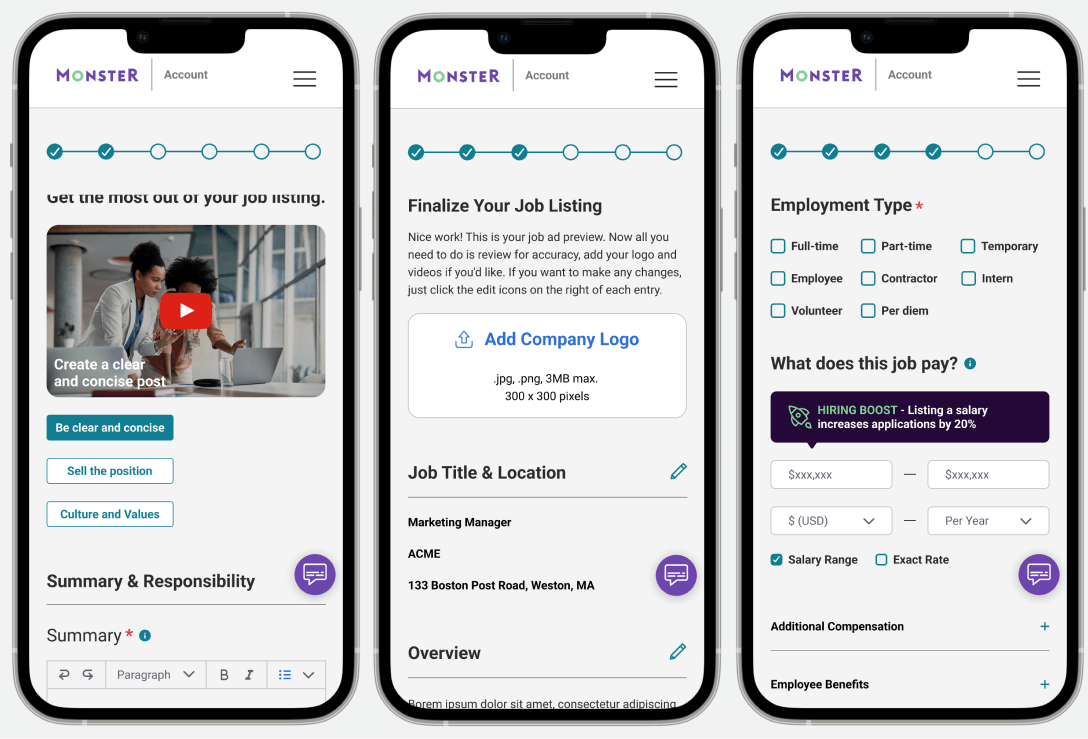
Concise and clear messaging helps users understand the value proposition quickly, increasing the chances of conversion. A well-designed visual hierarchy guides users’ attention to the most important elements, such as key information, quick links, and CTAs.
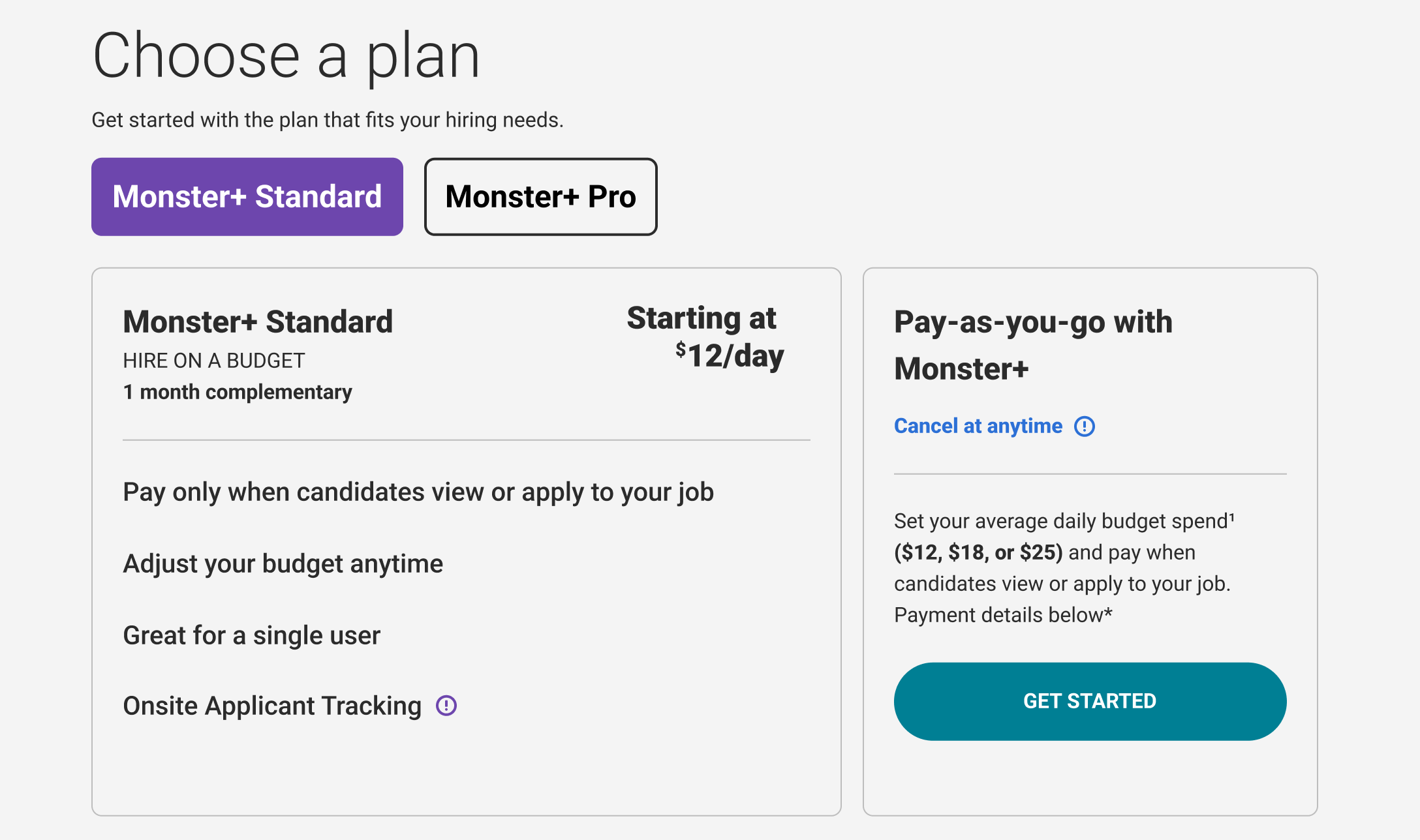
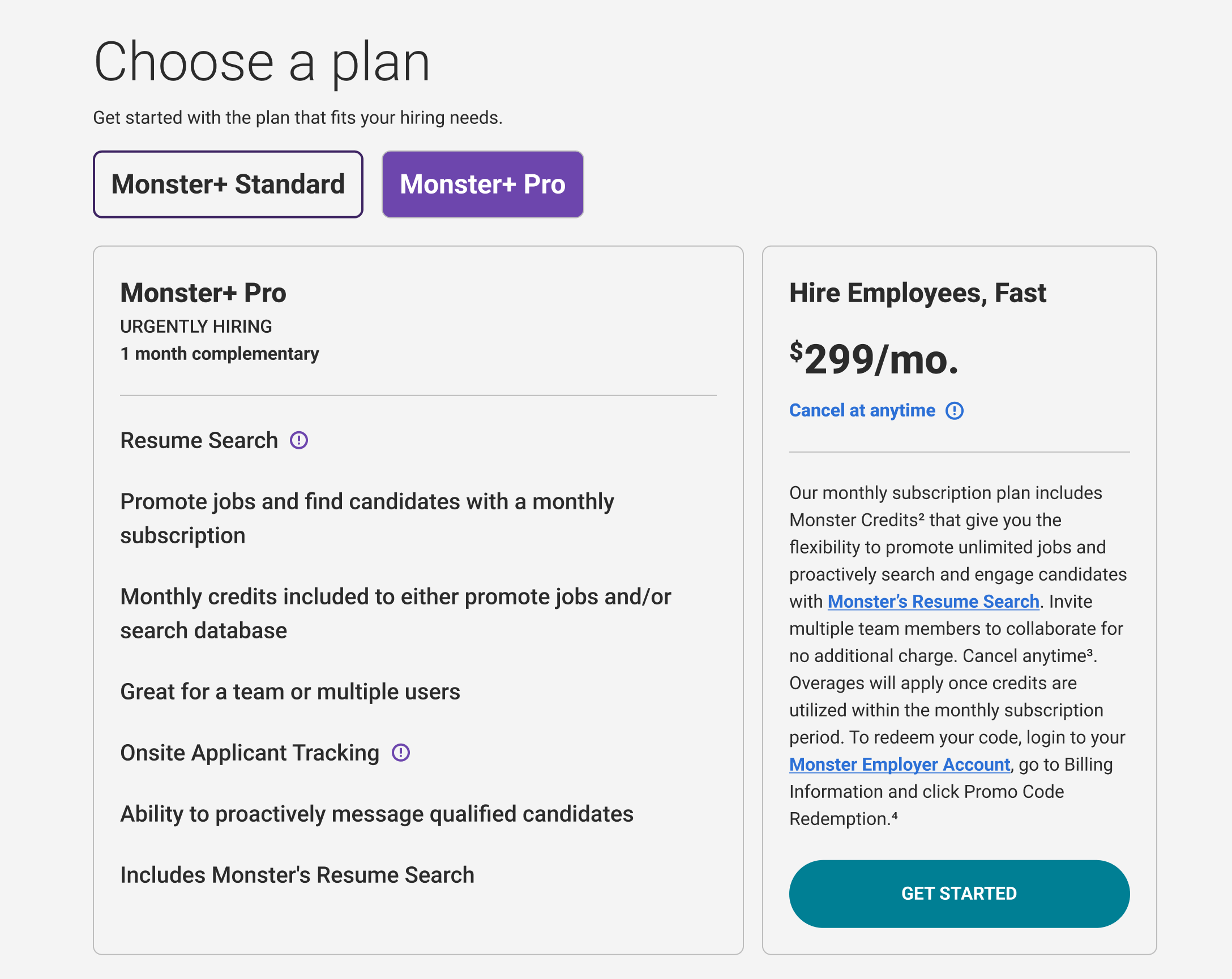
Replacing three options with two simplified pricing options
Key Design Elements
ux is all about sales
UX is very connected to a business and, in one word, to sales. Yeah, I know; UX is about supporting people in their tasks, making things more straightforward and user-centered. My main goal is to simplify things, make information more transparent, explain and show processes, clarify conditions, and make it easier to choose between options.
outcomes and impact
Post-launch metrics
Lower Bounce Rate:
Before redesign: 58%
After redesign: 38%
Increased Sales and Conversions:
Sales to our monthly programs increased by 35%.
Macro Conversions Rates: Up 13%
Micro Conversions Rates: Up 22%
Reduced Cart Abandonment:
On average, before redesign: 73%
On average, after redesign: 64%
Lower Churn Rate:
Before redesign: 6.9%
After redesign: 3.6%
working hard to make things simple
One of the most essential benefits of simplicity in UX design is improved usability. Simple designs are easier to use and understand, making it easier for users to complete tasks and access the information they need. This improved usability can result in higher satisfaction rates, more extended visits, and, ultimately, more conversions.
By making the user experience enjoyable and attractive, simplicity can help keep users engaged and increase the likelihood of them taking the desired action.
"Everything should be made as simple as possible, but no simpler."
Albert Einstein

